Trends in The Minnesota Economy Part 1
Section 1 - Overview
Minnesota’s economy has seen a lot of changes in the last couple of years. The pandemic and resulting lockdown stress-tested the resiliency of our economy, causing massive shifts in capital investment and labor mobility. State and local leaders have policy choices when it comes to economic investment priorities. Which industries should Minnesotans look to invest in? In which sectors should we be trying to compete with our peers? These are difficult questions to answer given how complex macroeconomic shifts can be. What is clear, is that Minnesota’s economy looks much different now than it did in 2010. In order to better understand our economic forecast, we’ve assembled some data to reveal our productive landscape in recent years. This blog series will cover a range of topics relating to the economy, both state and local. We hope that these posts provide an introduction to economic analysis for those who aren’t familiar, as well as detail interesting trends for policy professionals.
To analyze the components and growth of the Minnesota economy, we’ll chart gross domestic product(GDP). GDP is defined as:
“…the total monetary or market value of all the finished goods and services produced within a country’s borders in a specific time period. As a broad measure of overall domestic production, it functions as a comprehensive scorecard of a given country’s economic health.”
GDP is often used to compare between countries, but it is also useful at the state and local level to compare state economies and analyze industry trends.
To start, let’s take a look at how Minnesota ranks for GDP in 2022. Using 2021 population estimates from the U.S. Census Bureau, and Q2 GDP data, we calculate that Minnesota ranks 15th in the nation for GDP per capita. Minnesota has a per capita GDP of $61,108.56, meaning that the economy produces that amount for each Minnesota citizen. Figure 1 below shows the top 20 states in the U.S. by GDP per capita.
Note: GDP per capita is calculated by taking the total GDP of an area and dividing it by that area’s population. This effectively shows how much the state’s economy produces per person. A case can be made that a state which has a $50,000 per capita GDP has a “stronger” economy than a state with a $30,000 per capita GDP - regardless of population. Per capita GDP is particularly useful when comparing states with different sized populations, like between New York and North Dakota.
Note about inflation: Unless otherwise stated, all GDP data within this post is measured on an inflation-adjusted basis, using 2012 dollars.
Figure 1
Figure 1 demonstrates that Minnesota has a robust economy within the national context according to its per capita value. GDP per capita, however, does have its limits in providing a complete picture. The overall strength of an economy depends not only on how much it produces, but how diversified and resilient the underlying industries are. There are generally 20 industries which comprise the total GDP for each state, and their composition can be revealing. North Dakota for example has benefitted from an oil fracking boom which has elevated its GDP per capita. The Mining, quarrying, and oil and gas extraction industry is 16.5% of North Dakota’s total GDP. This is nearly as large as the next two sectors combined(Government and Real Estate), and is as large as the bottom 10 industries combined.
GDP Concentration
Concentration of GDP matters when evaluating the sustainability, and resiliency, of a given state’s economy. For example, if a state has one large industry and it is manufacturing Beanie Babies, a change in consumer preferences can cripple the entire sector. The state will then need to look to other industries to offset the loss in GDP. If the other industries of the state are not developed, or are outcompeted by neighboring states, the impact can be severe. Having a diverse range of robust industries prepares state economies for recessions, trade disruptions, and consumer preference changes(as in our Beanie Baby example).
We can measure how concentrated a state’s economy is by looking at how large and small the industries are which make up the total GDP. Using the same 20 industries we used in figure 1, we calculated how concentrated GDP is for Minnesota, and then compared that concentration to Minnesota’s neighbor states. States which are very concentrated can be more economically vulnerable if the dominant industries suffer a recession. Healthy economies do have strong industries which are larger than others, but rather than having one or two huge contributors to total GDP, resilient economies have 6 or 8 large contributors to total GDP.
GDP Concentration Among States
To measure state level GDP concentration, we used a metric called Herfindahl-Hirschman Index(HHI). This metric was originally developed to measure diversification within a single industry(e.g. steel industry). The HHI is used to determine whether there is strong competition among firms within an industry, or if there are monopolies forming due to a firm gaining too much market share. We have adopted the HHI to measure Minnesota’s GDP concentration relative to other bordering states. For more information about methodology, please see here.
Figure 2 below shows how concentrated Minnesota’s economy is using the HHI metric and compares it to bordering states. Please note that the scale on the Y axis(showing concentration) is for comparative purposes only, for reasons we’ll get to shortly. We can say definitively, however, that if all 20 industries measured had an equal share of the total GDP(5% for each industry), the value of that state’s index would be 500. We note this on the chart as “absolute diversity”. In other words, in a state economy with an HHI metric of 500, all industries are exactly the same size. It is more difficult to label the upper bound of the Y axis however, as research is still being performed concerning what threshold a GDP concentration index would have to reach to be considered “highly concentrated, or pose risk to the long term health of an economy. Instead we more simply demonstrate that compared to its peers, Minnesota’s economy is more diverse, and less concentrated. As we previously mentioned, a diverse economy can be a strength in periods where one or more major state industry is disrupted.
Figure 2
The composition of Minnesota’s economy
Next we will show Minnesota industries by proportion to the total GDP. Like many states, Minnesota has a diverse portfolio of industries. Included among these are a large medical manufacturing and research sector, financial management and banking, as well as robust governmental institutions. Figure 3 below shows how much each industry contributes to total GDP in Minnesota. Chart below gives a broad overview of Minnesota’s economy, and which industries are contributing most. In later sections, we’ll drill down through industry data to see which Minnesota counties have grown, or declined, in Minnesota’s leading industries.
Figure 3
Section 2 - Growth
Minnesota GDP Growth 2010 - 2020
To get a better sense of where Minnesota’s economy is headed, we should first look to historical GDP data. To begin, we’ll chart GDP growth between 2010-2020. This will provide a benchmark which we can then compare counties to later. In Figure 3, we identify the total output for a sector during 2010 and then again for 2020. We then calculate the increase in output for that industry between those ten years. This way, we can show in raw percentages which industries have grown the most in that time. There are a couple of important items to note about this calculation:
Figure 4 shows 5 industries with the largest growth increases, and 5 industries with the largest declines between 2010 - 2020. This measurement is not relative to other industries.
Figure 4 does not measure an industries contribution to the Minnesota economy as a whole. For example, the sector “management of companies and enterprises” grew by 31.58% between 2010-2020. It does not represent 31.58% of total Minnesota GDP for that period.
Industries are defined using the NAICS codes, which can be found at the Bureau of Economic Analysis site.
Figure 4
Total % Growth 2010-2020 - Top 5 and Bottom 5 Industries in Minnesota
Annualized GDP Growth
In this next section we will take a look at GDP growth from a different perspective, and map the growth of industries across Minnesota. The measurement we used is compound annual growth rate. This metric takes the 2010 GDP value and the 2020 GDP value, and then shows what percentage it would need to increase(or decrease) each year to get from the 2010 value to the 2020 value. For example, if GDP was $10 in 2010, and $26 in 2020, the annualized growth rate would be 10.03%. In other words, starting with $10 in 2010, GDP would need to grow 10.03% each year until 2020 to reach the final value of $26.
Annualized compound growth is a useful way to show how steep a growth curve is. Below are three examples of how annualized GDP growth can show growth over time:
Flat GDP growth(+- 0.5%/yr) Steep negative growth(-3% or more/yr) Steep positive growth(+3% or more/yr)
Additional notes for annualized %GDP growth:
Below each figure, there will be a definition of the industry analyzed according to the NAICS definition.
Some data is not reported for certain industries and counties. Missing data points will be shown below each figure, by county and reason for omitted data. The following reasons for omitted data are:
(NM)Not meaningful
(D) Not shown to avoid disclosure of confidential information; estimates are included in higher-level totals
Below each figure, we will list the five counties with the highest annualized growth for that sector, followed by the five counties with the largest declines. The overall state annualized GDP rate will also be given for that industry for comparison.
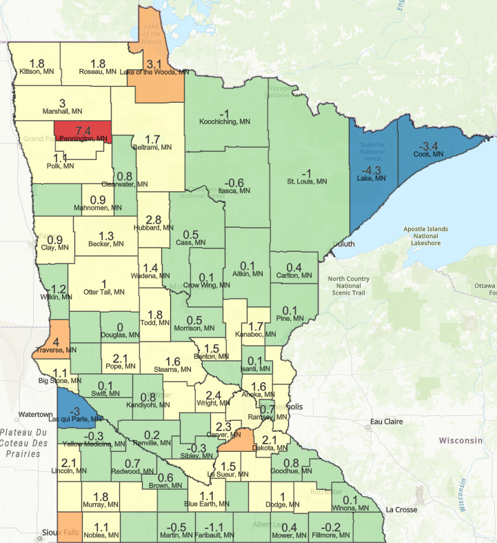
We begin with an annualized growth depiction of total GDP. Figure 5 below shows the annualized growth rate by county for total GDP of that county. For example, in Lake of the Woods County, total county GDP grew by 3.1% each year between 2010 - 2020. Conversely, total county GDP for Lake County declined by -4.3% each year between 2010-2020.
FIGURE 5
Annualized %Growth by County Between 2010 - 2020 - Total GDP
Top and Bottom Counties By Annualized Growth Rate - Total GDP
Bottom Five Counties
Lake County -4.3%
Cook county -3.4%
Lac Qui Parle County -3.0%
Wilkin County - 1.2%
Faribault County - -1.1%
Top Five Counties
Pennington County + 7.4%
Traverse County + 4.0%
Scott County +3.5%
Rock County + 3.2%
Lake of The Woods County + 3.1%
State annualized growth for total GDP 2010-2020= +1.3%
Section 3 - High Growth Industries
In this section we will map the industries for which Minnesota saw high growth between 2010 - 2020. Figures 6 through 8 below show the growth rates and losses corresponding with Minnesota’s largest sector increases, as noted in figure 4. Each map will depict the counties with the biggest gains, and losses within a given industry between 2010-2020. In the next post of this series, we will explore deeper into geographical patterns, why some counties seem to grow in certain industries and some do not.
FIGURE 6
Annualized %GDP Growth by County Between 2010-2020 - Management of Companies and Enterprises
Management of companies and enterprises
(D) Not shown to avoid disclosure of confidential information = 53/87 Counties
(NM) Not material = 10/87 counties
The Management of Companies and Enterprises NAICS sector comprises (1) establishments that hold the securities of (or other equity interests in) companies and enterprises for the purpose of owning a controlling interest or influencing management decisions or (2) establishments (except government establishments) that administer, oversee, and manage establishments of the company or enterprise and that normally undertake the strategic or organizational planning and decision-making role of the company or enterprise. Establishments that administer, oversee, and manage may hold the securities of the company or enterprise.
Top and Bottom Counties By Annualized Growth Rate - Management of Companies and Enterprises
Bottom Five Counties
Blue Earth County -5.8%
Scott County -5.7%
Clay County -5.7%
Crow Wing County -3.5%
Pope County -3%
Top Five Counties
Itasca County +27.6%
McLeod County +15.4%
Dakota County +12%
Hennepin County +4.3%
Carver County +4%
State total annualized growth for Management of Companies and Enterprises 2010 - 2020 = +3.9%
FIGURE 7
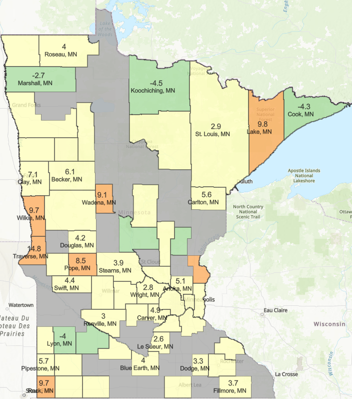
Annualized %GDP Growth by County Between 2010-2020 - Professional, Scientific, and Technical Services
Professional, scientific, and technical services
(NM) = 1/87 counties
(D) = 28/87 counties
The Professional, Scientific, and Technical Services NAICS sector comprises establishments that specialize in performing professional, scientific, and technical activities for others. These activities require a high degree of expertise and training. The establishments in this sector specialize according to expertise and provide these services to clients in a variety of industries and, in some cases, to households. Activities performed include: legal advice and representation; accounting, bookkeeping, and payroll services; architectural, engineering, and specialized design services; computer services; consulting services; research services; advertising services; photographic services; translation and interpretation services; veterinary services; and other professional, scientific, and technical services.
Top and Bottom Counties By Annualized Growth Rate - Professional, Scientific, and Technical Services
Bottom Five Counties
Koochiching County -4.5%
Cook County -4.3%
Lyon County -4%
Marshall County -2.7%
Redwood County -2.3%
Top Five Counties
Chisago County +18.1%
Traverse County +14.8%
Lake County +9.8%
Rock County +9.7%
Wilkin County +9.7%
State total annualized growth for Professional, Scientific, and Technical Services 2010 - 2020 = +3.4%
FIGURE 8
Annualized GDP Growth By County Between 2010-2020 - Manufacturing
Manufacturing
(NM) = 0/87 counties
(D) = 6/87 counties
The Manufacturing NAICS sector comprises establishments engaged in the mechanical, physical, or chemical transformation of materials, substances, or components into new products. The assembling of component parts of manufactured products is considered manufacturing, except in cases where the activity is appropriately classified in Sector 23, Construction.
Top and Bottom Counties By Annualized Growth Rate - Manufacturing
Bottom 5 Counties Manufacturing Growth
Lac Qui Parle County -9%
Big Stone County -4.6%
St. Louis County - 3.3%
Faribault County - 3.2%
Lyon County -3%
Top Counties Manufacturing Growth
Cass County +13.2%
Pennington Coutny +11%
Lincoln County +8.7%
Hubbard County +8.3%
Meeker County +8.3%
State total annualized growth for Manufacturing 2010 - 2020 = +1.6%
Figure 9
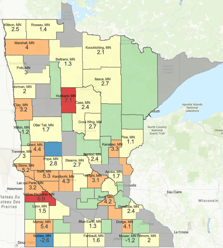
Annualized GDP Growth By County Between 2010-2020 - Trade
Trade
(NM) = 0/87 counties
(D) = 21/87 counties
Trade consists of wholesale and retail trade.
Top and Bottom Counties By Annualized Growth Rate - Trade
Bottom Five Counties
Douglas County -5.8%
Nobles County - 2.6%
Ramsey County -1.4%
Wilkin County -1.4%
Mower County -1.2%
Top Five Counties
Hubbard County +7.1%
Yellow Medicine County +6.9%
Murray County +5.4%
Swift County +5.3%
Big Stone County +5.2%
State total annualized growth for Trade 2010-2020 = +1.4%
Section 4 - Industries in Decline
In this section, figures 10 through 12 depict industry GDP trends for those industries which declined overall in Minnesota between 2010 - 2020, as shown in figure 4. Like in section 3, we map these industries by county to portray which parts of Minnesota are declining in these industries, and which areas are departing from the trend and growing. In the next post in this series we will cover these declines in more detail, and provide analysis on how and why these sectors shrank while others grew.
FIGURE 10
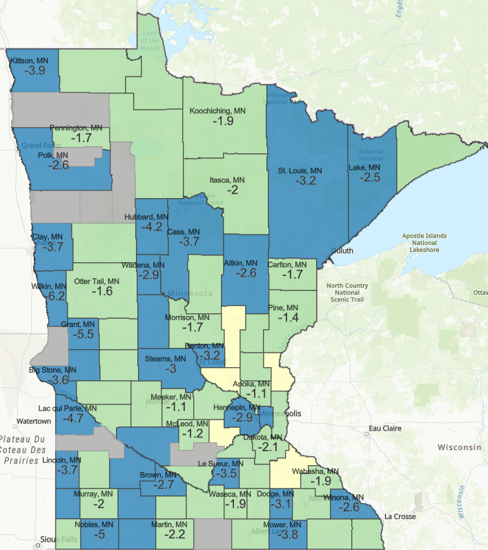
Annualized GDP Growth By County Between 2010-2020 - Accommodation and Food Services
Accommodation and Food Service
(NM) = 0/87 counties
(D) = 9/27 counties
The Accommodation and Food Services NAICS sector comprises establishments providing customers with lodging and/or preparing meals, snacks, and beverages for immediate consumption. The sector includes both accommodation and food services establishments because the two activities are often combined at the same establishment.
Top and Bottom Counties By Annualized Growth Rate - Accommodation and Food Services
Bottom Five Counties
Stevens County -7.2%
Wilkin County -6.2%
Renville County -6.1%
Grant County -5.5%
Nobles County -5%
Top Five Counties
Goodhue County +2.6%
Mille Lacs County +1.8%
Chisago County +1.7%
Sherburne County +1%
Carver County +0.9%
State total annualized growth for Accommodation and Food Services 2010 - 2020 = -2.1%
Figure 11
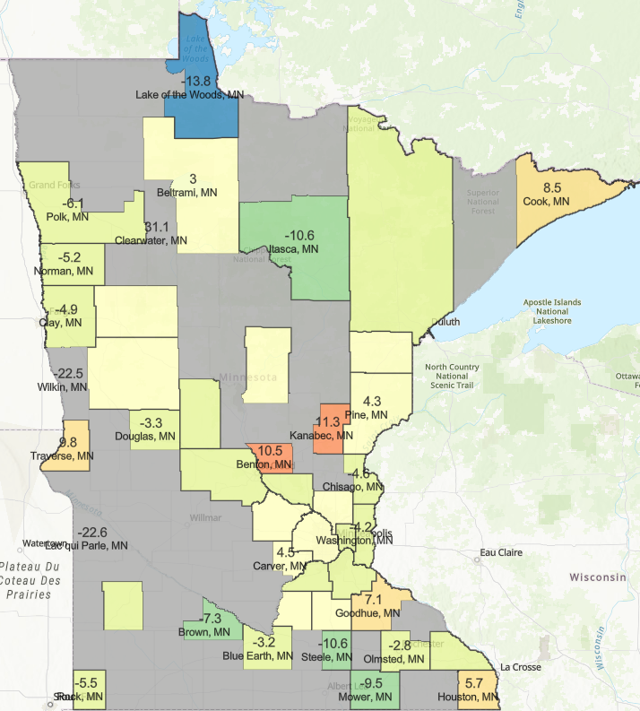
Annualized GDP Growth By County Between 2010-2020 - Educational Services
Educational Services
(NM) = 0/87 counties
(D) = 42/87 counties
The Educational Services (NAICS) sector comprises establishments that provide instruction and training in a wide variety of subjects. This instruction and training is provided by specialized establishments, such as schools, colleges, universities, and training centers. These establishments may be privately owned and operated for profit or not for profit, or they may be publicly owned and operated. They may also offer food and accommodation services to their students.
Bottom Five Counties
Watonwan County -27%
Lac qui Parle County =22.6%
Wilkin County -22.5%
Lake of the Woods County -13.8%
Steele County -10.6%
Top Five Counties
Clearwater County +31.1%
Kanabec County +11.3%
Benton County +10.5%
Traverse County +9.8%
Cook County +8.5%
State total annualized growth for Educational Services 2010 - 2020 = -1.7%
Figure 12
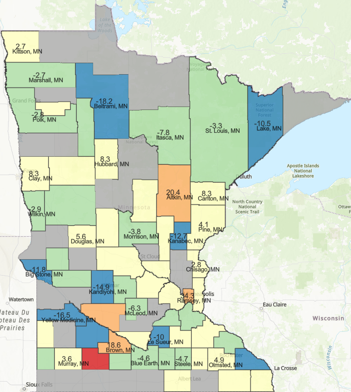
Annualized GDP Growth By County Between 2010-2020 - Mining, Quarrying, and Oil and Gas Extraction
Mining, quarrying, and oil and gas extraction
(NM) = 26/87 counties
(D) = 0/87 counties
This sector under NAICS comprises establishments that extract naturally occurring mineral solids, such as coal and ores; liquid minerals, such as crude petroleum; and gases, such as natural gas. The term mining is used in the broad sense to include quarrying, well operations, beneficiating (e.g., crushing, screening, washing, and flotation), and other preparation customarily performed at the mine site, or as a part of mining activity.
Top and Bottom Counties By Annualized Growth Rate - Mining, Quarrying, and Oil and Gas Extraction
Bottom Five Counties
Beltrami County -18.2%
Yellow Medicine County -16.5%
Redwood County -16.5%
Winona County -15.7%
Kandiyohi County -14.9%
Top Five Counties
Cottonwood County +65.6%
Ramsey County +34.3%
Aitkin County +20.4%
Renville County +19%
Brown County +18.6%


